Some places on the Isle are not looking great from a distance the colours don’t blend in.
I waited for this to report after latest update (which overhauled the light) but it didn’t seem to fix the distance graphics, this is why I decided to report this.
The Graphics are on ultra with the highest settings possible, motion blur on and anti aliasing maxed out.
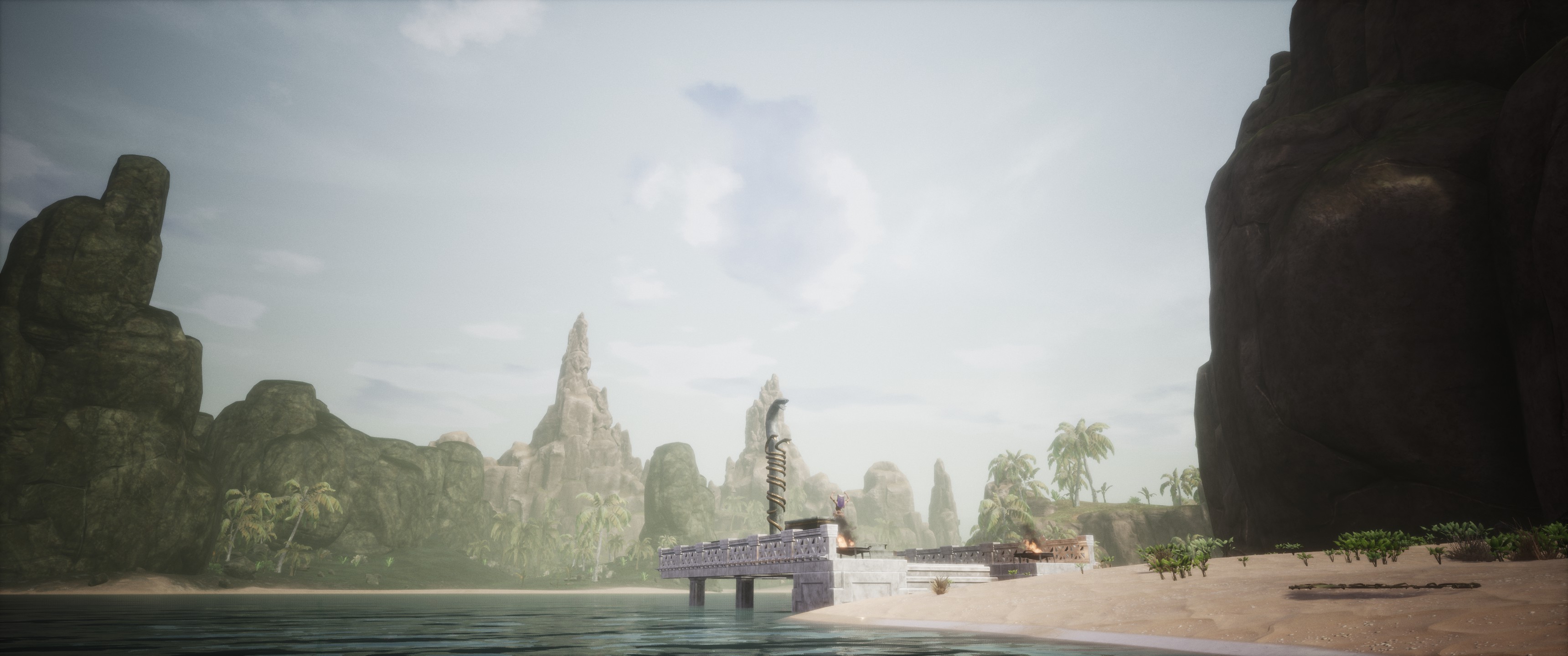
Here is a screenshot example of what I mean on the Isle:

Location: J9
- You can see here the trees in the distance look flat, this has obviously to do with optimization but the colours are way off. The colours or the textures should be changed.
- The rocks in the distance look maybe a bit to sharp with the sky contrast.

Location: N12
- The bushes on the shot are 2 flat pieces crossed.
- See the bigger trees not blending in.
This is only one example, will update this post when I see more, feel free to show your screenshots with feedback as well.
Compare the distance with the Exiled Lands:
Location: K7
- Notice the trees blending in the landscape.
- The rocks blend in much better in the distance and look softer to the sky.

Location: C11
- Both trees have a texture (colour) that blends in the landscape see the distant trees compared with the trees from the snow biome on the right.

Location: G7
- Notice in this shot the distant view is smooth even with all the vegetation and rocks.
All in all the Exiled lands looks more foggy, but the colouring is also better.