Can we have a list of destination to choose instead of those tidy floating stone, they so close to each other in most cases and more often then not transport us to a wrong location because the float stone rotating around and other stone just got toggle instead. I get it, it look cool that way but not practical at all.
3 Likes
Go to 1st person view, once inside the transportory stone. Keep in mind the destination stones are in the direction of the target destination. Knowing these two things makes it easier.
5 Likes
I want a Stargate like reskin for the transportory stone please “NO Excuses” They just gave us a crappy chalk reskin for the circle of power so I know they can do it
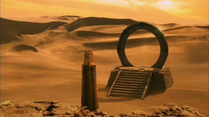
Come on it fits in so well I mean I now it’s probably copy right but still the symbols on the ring can replace the stones and this way you can limit the amount of transporters built by players per server.
2 Likes
well if you have couple tp at the same area those stone gonna be next to each other still better to give us a list instead
I’m in.
But you’ll need to memorize seven-symbol coordinates for each gate (ie. six for the target and one for the point of origin) and wait for the gate to rotate and chevrons to lock in place before you can teleport. And you’ll still get nauseated when transporting.
2 Likes
I second the OT…
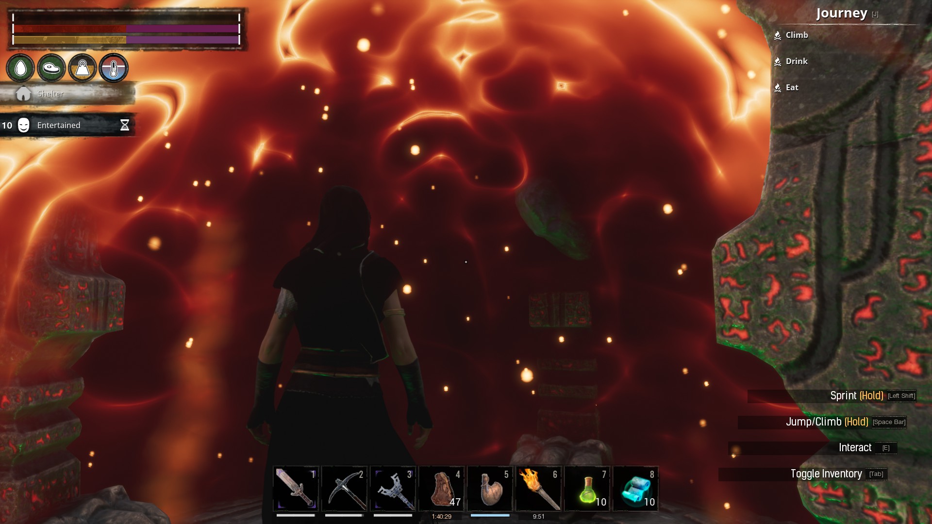
The minimum devs should do is to change the color of the floating stone to be really bright and easily noticeable and opposite color to the flamewavy effects. Since the flames are yellow/orange, then stone should be cyan blue or something.
Or increase the radius of the flame effects so they would be slightly beyond the portal itself instead of IN THE SORCERERS FACE that is standing inside the stone.
1 Like
W… What? Do… do you not know how to use your eyes? Like literally just look around ingame? It takes basically no time at all to just look for the right transport marker stone.
How on earth is that clunky? Like at all? Just because you have to take a modicum of effort? .-.
They’re all clearly named and you can even rename the stone to change the name of the stone in the selection thing. I fail to see at all how that is ‘clunky’ in even the most remote sense.
1 Like
I like it…it works with the stone words of power casting we do and its better immersion than a list of points in the network.
Maybe you got too many teleporters if it’s becoming cumbersome. …just saying because I had a network of 6 on one server and they worked just fine.
This
1 Like

I like the immersive aspect of the current UI, but it can be a pain in the ass. And no, it’s not because I have lots of transportory stones. The biggest network I’ve had is two nodes, which means only one destination to go to from each stone.
Even with the smallest network, it can still be annoyingly hard to use. The red aura creates a lot of visual noise and I often have to wiggle around because of the way the camera behaves.
I don’t really want a list. I like immersive UIs. But this one could stand some improvement.
4 Likes
There are plenty of times the stones are lost in the aura and I’ve had to blindly move around trying to get the transport option to pop up. And this is with 3 locations. I’ve also had a number of times where the stones seem to just be straight up invisible.
So a more user friendly option in addition to the current one is a perfectly valid request.
3 Likes
I originally liked the current set-up, but it has become clunky and inconvenient, especially when multiple destinations are in the same direction from the one you’re using. They cluster together, blend into the magic-sphere, and rotate. All of that makes teleportation something of a crapshoot.
Honestly, between the current system and just having a list, I’d have to lean toward practicality and just ask for a list. You can have the camera swivel to look at the stone associated with the destination if you want a bit of immersion. No matter what you do, the interface needs some fine tuning. Loosen the height restrictions so that stones in the same direction can be at different heights to avoid clumping together, give them a clear outline or color differentiation so they’re easier to see, and/or disable the rotation so that we’re not playing a timing puzzle when we want to fast travel.
3 Likes
Even on 1st person?
1 Like
The 1st person view helps with the camera wonkiness, but not with the visual noise. It’s definitely better, but having to switch to 1st person just so I can teleport annoys me.
And it’s not annoying just because it makes the process slower. It’s annoying because it interrupts my immersion. It reminds me that the camera is there and that it’s better to switch to 1st person so I can get this thing done ![]()
3 Likes
That’s a fact, @CodeMage . I guess I became used to camera switching in other games so now it hardly breaks my immersion. It’s like a “focus now” moment. We find ways to rationalize the strangest things. At first, I considered the whole system clumsy. Then I got used to it. I still hate the opacity of the bubble on arrival.
1 Like
It is clunky, but not for the reasons pointed out here. The graphics lag when transporting is huge for me and I have a damn good GPU. The flames need to be cut back some, so you can actually see the stones AND to cut back on some of this lag.
4 Likes
Loving the direction of this thread.
Yes the transportarry stones are hyper-active, walk too close it pops up, noise and animation, easy buddy, I’m not using you right now! Walk over it from the level above, the damn things starts making it noises, they are like the toilets at the airport that automatically flush sending toilet water against the stall walls if you shift left or right when sitting.
To clarify, I am a huge fan of the transportary stones, and public toilets, they are both hugely convenient. But the settings need to be correct. I make extra large room for transporter stones but still they go off a lot. And when using them if you have a base in the west and 2 other outposts they will bury each other because if you are in the west the other 2 stones will be to the East of you. Lots of messing around to get the right one. If you are in the Jungle and wish to travel West, your 2 other destinations will bury each other because they are both to the West of your Eastern most point. And the “visual noise” of the teleportation stone does not have to so completely drown out everything, tone it down, if you weren’t blinded by rotating redness, you could fine tune your movements, and grab the one you need, and the animation jumps so that you can grab the right one, and bang as you click the other is in your hand…damnit.
Like the public toilet previously mentioned, transportory stones are amazing, helpful, and greatly appreciated, but somebody pls make an adjustment so that they can calm the heck down!
(Rant ends. Thank you for your time).
4 Likes
This one would certainly not mind a Star Gate style skin for the teleport circles. Perhaps in next season BP.
Jesting aside, this one would much prefer if the fire dome either calmed down or was pushed out further so the stones aren’t floating on the wrong side of it. (Yes, this one has switches to first person, yes they are still floating in rather than inside the cascade)
While some noise is understandable, to disincentivize cluttering the map with these things, it could use a touch more smoothing.
While it does take a few moments to load leaving it sub optimal for in battle applications (has anyone shut the teleporter off while someone was in mid port? Do they die? Does Yog eat them? Are they lost in time and space forever?) it’s still faster than walking through or riding a horse around the Maelstrom so this one won’t complain.
2 Likes
On second look, I suppose its not TOO bad. There is actually a kind of green color when the stone is not on focus, which does contrast a bit to the flame effects. And the way it rotates with its poor texture make me think of poor 80s scifi effects, which is kinda cool and fitting ![]()
But Id prefer a list.
Not sure if FC actually managed to change things in such a short amount of time or if I’m just imaging things, but it feels like the clutter has gone down a bit. Stones now seem to float somewhere between waist level and just above your head, which I don’t think they did before and alleviates a lot of the clumping issues. Visually, it can still be a little hard to see some of the stones, but the system seems a lot better now than it was before. My accidentally-clicking-the-wrong-stone syndrome has pretty much disappeared. So thanks for the quick-fix, FC.
1 Like